Discussion - Member to Member Sales - Research Center
Discussion - Member to Member Sales - Research Center

Two stamps of which Scott and Gibbons use the same numbers. They are from the 1891 first issue of British Central Africa, later to become Nyasaland and Malawi. SG/Scott 4 is described as 'ultramarine" while SG/Scott 5 is described as either "deep blue" or "dark blue". One is valued at two to four times the other. Anybody care to guess which is which? I may have just picked up a bargain rather than just an average buy.

p.s. Neither of these illustrated is mine which should be in the post to me right now.

2 Members
like this post.
Login to Like.
Left = ultramarine
Right = deep blue
4 Members
like this post.
Login to Like.
This is an interesting illustration of how revealing it is to have stamps of different color variations displayed together. It really facilitates making the distinction! And, it somewhat negates the effect of variation in individual computer displays. This is something that most collectors can struggle with regularly.
-Paul
2 Members
like this post.
Login to Like.

08:16:44am
Usually color shade differences are the result of multiple printings. Today we have computer matching but when older stamps were produced they had to do it by hand and since it might have been several years later - also from memory.
I like to get as many stamps of the same type as possible and place them on black paper under good lighting. The differences will show up pretty quickly this way.
If you collect British Colony shades, I have over 160 web pages with more than 3,300 images devoted to identifying them on my website. Use the link below to find the index showing all of the current pages.
http://www.kgvistamps.com/KGVIStamps-ArticleIndex.html
5 Members
like this post.
Login to Like.
Thank you all for your comments. Michael I hope you are correct because that would make the one I bought a real bargain. This was two days ago and the eBay dealer had one of each on sale. By rights the ultramarine should have been the more expensive, but most of the bids were going on the deep blue stamp and it sold for four times the ultramarine one which I won. It should have been the other way around. I have gone back and looked and the ultramarine one had some slight toning, but it still doesn't make sense as the deep blue example was getting close to catalogue value.
Now just to confuse the issue a bit more here is a scan of my very old Gibbons stamp colour key. I guess what we could say is that ultramarine has more violet in it, which agrees with Michael.

1 Member
likes this post.
Login to Like.
"Thank you all for your comments. Michael I hope you are correct because that would make the one I bought a real bargain. "
Michael is absolutely correct, the left hand stamp is the ultramarine.
There could be a number of reasons for the right hand stamp going for more, it could be something as simple as other bidders not noticing the ultramarine.
One thing to watch for on these stamps is the watermark. Unlike regular watermarked stamps which have a distinct watermark, these were printed on paper that came watermarked from the manufacturer (something like the expensive writing paper we used when we wrote with pens). So an individual stamp may have no or very little watermark.
Some collectors will pay a premium if the stamp has a large part of a watermark and it was mentioned in the listing. See here for an example http://www.rhodesia.co.za/Item.aspx?ItemID=13822
Actually the http://www.rhodesia.co.za/ site is one of my favourite references for British South Africa Company and BCA stamps.
Clive
Login to Like
this post
Clive thanks for that link. Now I have no doubts I will use this site as a reference and there are items I would love to buy off it, although maybe when I have a good win on the lottery.
It wasn't these two stamps on which I was bidding and I went back to look at any oddity such as postmarks. Sometimes in early Thai/Siam stamps we see bidding take off in small mixes because of a postmark, usually towns in what is now Cambodia or Malaysia. My suspicion was that bidders suspected the seller had the stamps the wrong way round, but possibly there are varieties in the B.C.A. overprint I know nothing about.
I must give a plug to AlbumEasy into which pages my BCA collection will end up. The beauty of it is that you can redesign them to take pairs, varieties and so on. Nothing is fixed.
1 Member
likes this post.
Login to Like.
Danny,
Deverell/Macgregor (www.rhodesia.co.za) does have some wonderful material, unfortunately most of it out of my price range, but at least we can look and it does make a useful reference.
Good luck with your BCA album pages, please shout if you have any questions whith using AlbumEasy.
Regards,
Clive
1 Member
likes this post.
Login to Like.

A nice chunk of lapis lazuli. This was the source of ultramarine blue for many thousands of years, it still is if you want to process it as in days gone by - grinding it up and separating out the pyrite, etc. in an elaborate process. The blue lazurite is the source of classic ultramarine pigment.
The Sar-e-Sang mines in Afghanistan are the best source of lapis lazuli, and have been for the last 6,000 years. Ultramarine pigment made from lapis lazuli was insanely expensive, and used sparingly, often for Mary's robes and especially nice angels.
With the onset of synthetic dyes and pigments, a synthetic ultramarine was inexpensive enough to use to color even STAMPS. I figured I had to work stamps in there at some point.
Cheers!
Wine
2 Members
like this post.
Login to Like.
https://colorpix.en.softonic.com/
save color as you point ...
Login to Like
this post
To be argumentative I think they "may" both be ultramarine ( the left one slightly faded or a different ink recipe as pointed out in one of the above posts).
The only way to be sure is to compare with a positively ID'd deep/dark blue example.
Additionally line engraved stamps give a different impression on the eye to solid colour as on colour swatches - and this confuses the issue here.
Malcolm
1 Member
likes this post.
Login to Like.
This is precisely why I use this ancient colour chart!


3 Members
like this post.
Login to Like.
Color charts have a shelf life of a few years; after that they suffer from the same exact environmental and chemical issues (fading, changing, etc.) as stamps. The only way to become highly proficient in stamp colors is to build a good reference collection, develop a good ‘color eye’, and standardize your ambient lighting conditions.
Don
Login to Like
this post
Just to add, and pardon me if I may have misunderstood the initial post.
That Scott calls BCA #4 ultramarine, and SG calls out the stamp as deep blue, doesn't mean there were separate printings of the two colors. Scott and SG have different conventions of naming colors -- but they are talking about the same color.
Of course different printings can result in shades, and other factors account for color change.
Login to Like
this post
Winedrinker, I think Scott and gibbons are in sync on these two stamps. Both describe #4 as ultramarine while #5 is dark blue or deep blue depending on the catalogue used.
Login to Like
this post
Ahhhh. Sorry about that Danny, I did not read your initial post carefully enough.
1 Member
likes this post.
Login to Like.

Here are my BCA 4 and 5 for a further color comparison.
Cheers!
Wine
1 Member
likes this post.
Login to Like.
I have seen the SG Colour Guide once. It isn't very common to find on this side of the pond. It is an interesting item.
Login to Like
this post
They show up on eBay occasionally like these...
ebaylink1
ebay2
ebay3
ebay4
I concur that they are interesting, but it is unclear to me why anyone would pay significant amounts of money for this kind of item. There is no telling how previous owners stored them and may have even left one open on the desk under a window.
Typically color standards (i.e. Pantone) are thrown away and repurchased every year or two. You can buy some color standards on coated metal or plastic and these last a bit longer before the colors begin to change.
Don
1 Member
likes this post.
Login to Like.

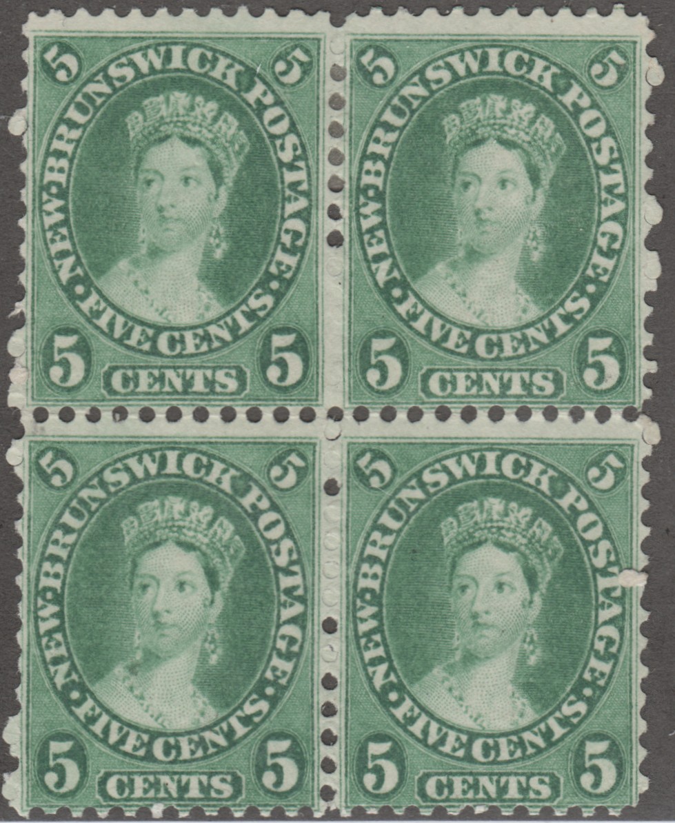
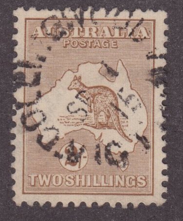
I'm not sure I know anyone that replaces their colour guides on a regular basis, and it's the only colour guide that approximates colour on an engraved stamp. However, experience is the best teacher. I can identify at a glance around six shades of the GB KGV 6d purple definitive, and around eight shades of the Australian KGV 1d green, for example, simply because I handle so many stamps
Login to Like
this post
Hi Dave,
Many professional (designers, graphic artists, publishers, etc.) and others who count upon accurate color identification replace their color guides annually.
From the Pantone website ( https://www.pantone.com/color-intelligence/articles/technical/how-many-pantone-colors-are-you-missing )
"If you haven’t upgraded your Pantone Guides and books for several years, your colors are no longer meeting full market demand nor are they reliably accurate.
Here’s why:
Handling = Smearing and removing pigment from natural oils on fingertips
Pages rubbing together = Scratching or removing pigment
Light exposure = Fading
Paper aging = Yellowing effects
Ambient moisture = Accelerating paper aging
However, our guides will not last forever. Due to handling, fading, and aging, your colors will appear inaccurate over time. That’s why we recommend replacing your guides every 12-18 months, depending on your usage case and storage habits."

Pantone uses the above image to demonstrate how a color guide changes over time.
I 100% agree with you that experience and a good 'color eye' is the best color tool. There are no short cuts to good color identification, some folks think that buying a color guide will allow them to ID colors but it is not that simple. Just as you state, you developed a good color eye by viewing very large quantities of reference stamps.
Don
Login to Like
this post
Wine, thank you for showing your BCA overprints. The more I look the more I think I see differences in the B.C.A. overprint. I will obviously need to research this a bit more. Nothing is simple
My fairly old, 30 years plus, Gibbons Stamp Colour Key is shown below. I have to admit it didn't answer the original question, hence why I asked it here. It serves another important purpose though. It supports one side of my keyboard by replacing a broken leg. I know people will ask why I am so cheap with keyboards costing so little, but I am sure at least some will have noticed that apparel like shirts and shoes are always most comfortable just before they disintegrate. My keyboard is a bit like that. One day it will have to go, but I will put it off until the last moment. When I do, every time I need the colour key it will take an hour finding where I stored it.

2 Members
like this post.
Login to Like.
Danny, you are very welcome. And since we are showing off our SG Stamp Color Keys, here is mine with a chunk of lapis lazuli under the "ultramarine." Very clever using your guide for a Keyboard support by the way.
Don, you may be right about folks replacing their color guides on a regular basis. But I reckon I'll be sticking with mine for a while (forever), discoloration and fading be damned - I want to get my money's worth.
On a side note, and it may be because I have been watching way too many British detective shows, the Pantone example you depict makes me suspicious that Pantone went out of their way to find (or create) the world's scruffiest sun-dried "bad" example to place next to the newer swatch. I could be wrong I suppose, that happens sometimes.
Cheers!
Wine

1 Member
likes this post.
Login to Like.
Hi Don, I'm sure design pros update their guides, my point was re philatelists, who are very different beasts
Login to Like
this post
Wine,
Yes, you are correct that Pantone is trying to sell color standards.
Dave,
I have been involved in accurate color matching for much of my engineering career. This experience includes designing products for major corporations who obviously wanted the product or label colors to exactly match their company brands. And when you are buying hundreds of thousands of dollars of a molded plastic part or a label you need to be able to do incoming inspection and receive that component in the correct color. Close is not good enough, it has to be an exact match.
Most manufacturing companies are ISO certified, so there are ISO specifications used to match colors in a manufacturing environment. Pantone is the most widely used color standard so if you are manufacturing a product, part, or label for Ford Motor Company or Coke Cola; specific Pantone colors would be specified by them. If you do not match exactly, you do not get paid. So company ISO quality standards require that you have a new Pantone color system every year. (So it is more than just Pantone trying to sell color matching standards.)
While the above sounds fairly simple and straight forward, color matching is a very difficult task. One of the first things you find out is that different people see colors differently. Women tend to be better color matchers than men (they have more color detecting cones in their eyes). But ambient light also plays a huge role in proper color matching. Colors are all about how light waves are reflected off of a surface; so those light waves determine what color we see. Here is an example of ‘metamerism’. Metamerism is when two colors that are not actually the same appear the same under certain lighting conditions.


Light Source + Object + Observer = Color Perception. So company ISO quality standards also highly define the light source (ambient lighting) for matching colors. You cannot match a color under the sodium warehouse lighting one time and under the office florescent the next time.
My hope is that this information will help folks better understand color matching. It is quite challenging for collectors and I wish our hobby had better education and standards on this very tricky topic. Color confusion is driven by catalog publishers who call out different stamp varieties by color and different publishers using different color names. The internet has only made this topic even worse since collectors are now trying to use images for color identification. This has only made things a LOT more difficult.
Don
2 Members
like this post.
Login to Like.
Don, thanks for that information. Truly goes to show how difficult it is to standardize colors. So many factors. One valiant effort in the past was the ISCC-NBS Method of Designating Colors and a Dictionary of Color Names, printed in 1955 by the National Bureau of Standards. There is a fine site (the Texas Precancel Club) that has put this work ONLINE, with color swatches and hex codes! This work included colors from all industries, including stamp colors. Here is a link to the stamp colors page, but explore links on bottom for further fun and the ISCC-NBS in complete form. Quite an obsessive project.
tx4.us/nbsstamp.htm
(also, http://www.december.com/html/spec/colorucl2.html provides hex codes for the color centroids provided by the ISCCC-NBS in the first link)
Wine
Login to Like
this post
bump
Login to Like
this post

Two stamps of which Scott and Gibbons use the same numbers. They are from the 1891 first issue of British Central Africa, later to become Nyasaland and Malawi. SG/Scott 4 is described as 'ultramarine" while SG/Scott 5 is described as either "deep blue" or "dark blue". One is valued at two to four times the other. Anybody care to guess which is which? I may have just picked up a bargain rather than just an average buy.
p.s. Neither of these illustrated is mine which should be in the post to me right now.
2 Members
like this post.
Login to Like.

re: Colour (color) question
Left = ultramarine
Right = deep blue
4 Members
like this post.
Login to Like.
07:07:06am
re: Colour (color) question
This is an interesting illustration of how revealing it is to have stamps of different color variations displayed together. It really facilitates making the distinction! And, it somewhat negates the effect of variation in individual computer displays. This is something that most collectors can struggle with regularly.
-Paul
2 Members
like this post.
Login to Like.
Collecting King George VI from all countries, and King Edward VII and King George V from the West Indies.
22 Sep 2018
08:16:44am
re: Colour (color) question
Usually color shade differences are the result of multiple printings. Today we have computer matching but when older stamps were produced they had to do it by hand and since it might have been several years later - also from memory.
I like to get as many stamps of the same type as possible and place them on black paper under good lighting. The differences will show up pretty quickly this way.
If you collect British Colony shades, I have over 160 web pages with more than 3,300 images devoted to identifying them on my website. Use the link below to find the index showing all of the current pages.
http://www.kgvistamps.com/KGVIStamps-ArticleIndex.html
5 Members
like this post.
Login to Like.
re: Colour (color) question
Thank you all for your comments. Michael I hope you are correct because that would make the one I bought a real bargain. This was two days ago and the eBay dealer had one of each on sale. By rights the ultramarine should have been the more expensive, but most of the bids were going on the deep blue stamp and it sold for four times the ultramarine one which I won. It should have been the other way around. I have gone back and looked and the ultramarine one had some slight toning, but it still doesn't make sense as the deep blue example was getting close to catalogue value.
Now just to confuse the issue a bit more here is a scan of my very old Gibbons stamp colour key. I guess what we could say is that ultramarine has more violet in it, which agrees with Michael.
1 Member
likes this post.
Login to Like.

re: Colour (color) question
"Thank you all for your comments. Michael I hope you are correct because that would make the one I bought a real bargain. "
Michael is absolutely correct, the left hand stamp is the ultramarine.
There could be a number of reasons for the right hand stamp going for more, it could be something as simple as other bidders not noticing the ultramarine.
One thing to watch for on these stamps is the watermark. Unlike regular watermarked stamps which have a distinct watermark, these were printed on paper that came watermarked from the manufacturer (something like the expensive writing paper we used when we wrote with pens). So an individual stamp may have no or very little watermark.
Some collectors will pay a premium if the stamp has a large part of a watermark and it was mentioned in the listing. See here for an example http://www.rhodesia.co.za/Item.aspx?ItemID=13822
Actually the http://www.rhodesia.co.za/ site is one of my favourite references for British South Africa Company and BCA stamps.
Clive
Login to Like
this post
re: Colour (color) question
Clive thanks for that link. Now I have no doubts I will use this site as a reference and there are items I would love to buy off it, although maybe when I have a good win on the lottery.
It wasn't these two stamps on which I was bidding and I went back to look at any oddity such as postmarks. Sometimes in early Thai/Siam stamps we see bidding take off in small mixes because of a postmark, usually towns in what is now Cambodia or Malaysia. My suspicion was that bidders suspected the seller had the stamps the wrong way round, but possibly there are varieties in the B.C.A. overprint I know nothing about.
I must give a plug to AlbumEasy into which pages my BCA collection will end up. The beauty of it is that you can redesign them to take pairs, varieties and so on. Nothing is fixed.
1 Member
likes this post.
Login to Like.
re: Colour (color) question
Danny,
Deverell/Macgregor (www.rhodesia.co.za) does have some wonderful material, unfortunately most of it out of my price range, but at least we can look and it does make a useful reference.
Good luck with your BCA album pages, please shout if you have any questions whith using AlbumEasy.
Regards,
Clive
1 Member
likes this post.
Login to Like.

re: Colour (color) question
A nice chunk of lapis lazuli. This was the source of ultramarine blue for many thousands of years, it still is if you want to process it as in days gone by - grinding it up and separating out the pyrite, etc. in an elaborate process. The blue lazurite is the source of classic ultramarine pigment.
The Sar-e-Sang mines in Afghanistan are the best source of lapis lazuli, and have been for the last 6,000 years. Ultramarine pigment made from lapis lazuli was insanely expensive, and used sparingly, often for Mary's robes and especially nice angels.
With the onset of synthetic dyes and pigments, a synthetic ultramarine was inexpensive enough to use to color even STAMPS. I figured I had to work stamps in there at some point.
Cheers!
Wine
2 Members
like this post.
Login to Like.

re: Colour (color) question
https://colorpix.en.softonic.com/
save color as you point ...
Login to Like
this post
05:16:35am
re: Colour (color) question
To be argumentative I think they "may" both be ultramarine ( the left one slightly faded or a different ink recipe as pointed out in one of the above posts).
The only way to be sure is to compare with a positively ID'd deep/dark blue example.
Additionally line engraved stamps give a different impression on the eye to solid colour as on colour swatches - and this confuses the issue here.
Malcolm
1 Member
likes this post.
Login to Like.

re: Colour (color) question
This is precisely why I use this ancient colour chart!
3 Members
like this post.
Login to Like.

re: Colour (color) question
Color charts have a shelf life of a few years; after that they suffer from the same exact environmental and chemical issues (fading, changing, etc.) as stamps. The only way to become highly proficient in stamp colors is to build a good reference collection, develop a good ‘color eye’, and standardize your ambient lighting conditions.
Don
Login to Like
this post
re: Colour (color) question
Just to add, and pardon me if I may have misunderstood the initial post.
That Scott calls BCA #4 ultramarine, and SG calls out the stamp as deep blue, doesn't mean there were separate printings of the two colors. Scott and SG have different conventions of naming colors -- but they are talking about the same color.
Of course different printings can result in shades, and other factors account for color change.
Login to Like
this post
re: Colour (color) question
Winedrinker, I think Scott and gibbons are in sync on these two stamps. Both describe #4 as ultramarine while #5 is dark blue or deep blue depending on the catalogue used.
Login to Like
this post
re: Colour (color) question
Ahhhh. Sorry about that Danny, I did not read your initial post carefully enough.
1 Member
likes this post.
Login to Like.
re: Colour (color) question
Here are my BCA 4 and 5 for a further color comparison.
Cheers!
Wine
1 Member
likes this post.
Login to Like.
re: Colour (color) question
I have seen the SG Colour Guide once. It isn't very common to find on this side of the pond. It is an interesting item.
Login to Like
this post
re: Colour (color) question
They show up on eBay occasionally like these...
ebaylink1
ebay2
ebay3
ebay4
I concur that they are interesting, but it is unclear to me why anyone would pay significant amounts of money for this kind of item. There is no telling how previous owners stored them and may have even left one open on the desk under a window.
Typically color standards (i.e. Pantone) are thrown away and repurchased every year or two. You can buy some color standards on coated metal or plastic and these last a bit longer before the colors begin to change.
Don
1 Member
likes this post.
Login to Like.
re: Colour (color) question
I'm not sure I know anyone that replaces their colour guides on a regular basis, and it's the only colour guide that approximates colour on an engraved stamp. However, experience is the best teacher. I can identify at a glance around six shades of the GB KGV 6d purple definitive, and around eight shades of the Australian KGV 1d green, for example, simply because I handle so many stamps
Login to Like
this post
re: Colour (color) question
Hi Dave,
Many professional (designers, graphic artists, publishers, etc.) and others who count upon accurate color identification replace their color guides annually.
From the Pantone website ( https://www.pantone.com/color-intelligence/articles/technical/how-many-pantone-colors-are-you-missing )
"If you haven’t upgraded your Pantone Guides and books for several years, your colors are no longer meeting full market demand nor are they reliably accurate.
Here’s why:
Handling = Smearing and removing pigment from natural oils on fingertips
Pages rubbing together = Scratching or removing pigment
Light exposure = Fading
Paper aging = Yellowing effects
Ambient moisture = Accelerating paper aging
However, our guides will not last forever. Due to handling, fading, and aging, your colors will appear inaccurate over time. That’s why we recommend replacing your guides every 12-18 months, depending on your usage case and storage habits."
Pantone uses the above image to demonstrate how a color guide changes over time.
I 100% agree with you that experience and a good 'color eye' is the best color tool. There are no short cuts to good color identification, some folks think that buying a color guide will allow them to ID colors but it is not that simple. Just as you state, you developed a good color eye by viewing very large quantities of reference stamps.
Don
Login to Like
this post
re: Colour (color) question
Wine, thank you for showing your BCA overprints. The more I look the more I think I see differences in the B.C.A. overprint. I will obviously need to research this a bit more. Nothing is simple
My fairly old, 30 years plus, Gibbons Stamp Colour Key is shown below. I have to admit it didn't answer the original question, hence why I asked it here. It serves another important purpose though. It supports one side of my keyboard by replacing a broken leg. I know people will ask why I am so cheap with keyboards costing so little, but I am sure at least some will have noticed that apparel like shirts and shoes are always most comfortable just before they disintegrate. My keyboard is a bit like that. One day it will have to go, but I will put it off until the last moment. When I do, every time I need the colour key it will take an hour finding where I stored it.
2 Members
like this post.
Login to Like.
re: Colour (color) question
Danny, you are very welcome. And since we are showing off our SG Stamp Color Keys, here is mine with a chunk of lapis lazuli under the "ultramarine." Very clever using your guide for a Keyboard support by the way.
Don, you may be right about folks replacing their color guides on a regular basis. But I reckon I'll be sticking with mine for a while (forever), discoloration and fading be damned - I want to get my money's worth.
On a side note, and it may be because I have been watching way too many British detective shows, the Pantone example you depict makes me suspicious that Pantone went out of their way to find (or create) the world's scruffiest sun-dried "bad" example to place next to the newer swatch. I could be wrong I suppose, that happens sometimes.
Cheers!
Wine
1 Member
likes this post.
Login to Like.
re: Colour (color) question
Hi Don, I'm sure design pros update their guides, my point was re philatelists, who are very different beasts
Login to Like
this post
re: Colour (color) question
Wine,
Yes, you are correct that Pantone is trying to sell color standards.
Dave,
I have been involved in accurate color matching for much of my engineering career. This experience includes designing products for major corporations who obviously wanted the product or label colors to exactly match their company brands. And when you are buying hundreds of thousands of dollars of a molded plastic part or a label you need to be able to do incoming inspection and receive that component in the correct color. Close is not good enough, it has to be an exact match.
Most manufacturing companies are ISO certified, so there are ISO specifications used to match colors in a manufacturing environment. Pantone is the most widely used color standard so if you are manufacturing a product, part, or label for Ford Motor Company or Coke Cola; specific Pantone colors would be specified by them. If you do not match exactly, you do not get paid. So company ISO quality standards require that you have a new Pantone color system every year. (So it is more than just Pantone trying to sell color matching standards.)
While the above sounds fairly simple and straight forward, color matching is a very difficult task. One of the first things you find out is that different people see colors differently. Women tend to be better color matchers than men (they have more color detecting cones in their eyes). But ambient light also plays a huge role in proper color matching. Colors are all about how light waves are reflected off of a surface; so those light waves determine what color we see. Here is an example of ‘metamerism’. Metamerism is when two colors that are not actually the same appear the same under certain lighting conditions.
Light Source + Object + Observer = Color Perception. So company ISO quality standards also highly define the light source (ambient lighting) for matching colors. You cannot match a color under the sodium warehouse lighting one time and under the office florescent the next time.
My hope is that this information will help folks better understand color matching. It is quite challenging for collectors and I wish our hobby had better education and standards on this very tricky topic. Color confusion is driven by catalog publishers who call out different stamp varieties by color and different publishers using different color names. The internet has only made this topic even worse since collectors are now trying to use images for color identification. This has only made things a LOT more difficult.
Don
2 Members
like this post.
Login to Like.
re: Colour (color) question
Don, thanks for that information. Truly goes to show how difficult it is to standardize colors. So many factors. One valiant effort in the past was the ISCC-NBS Method of Designating Colors and a Dictionary of Color Names, printed in 1955 by the National Bureau of Standards. There is a fine site (the Texas Precancel Club) that has put this work ONLINE, with color swatches and hex codes! This work included colors from all industries, including stamp colors. Here is a link to the stamp colors page, but explore links on bottom for further fun and the ISCC-NBS in complete form. Quite an obsessive project.
tx4.us/nbsstamp.htm
(also, http://www.december.com/html/spec/colorucl2.html provides hex codes for the color centroids provided by the ISCCC-NBS in the first link)
Wine
Login to Like
this post