Discussion - Member to Member Sales - Research Center
Discussion - Member to Member Sales - Research Center
What we have here is Scott 191. Full VF centering. Attractive face-free cancel. 100% sound and 100% beautiful. This is the type of stamp I want to anchor my collection.


11 Members
like this post.
Login to Like.

06:37:09pm
Really nice stamp Ernie. Mine has a small thin on the back and much more of a postmark. It's the classic stuff I really like and it's getting much harder to get at a fair price. I have a couple really nice classics coming in the next month and I'll show a scan when they arrive. I'm not going to "let the cat out of the bag" yet but they're real special!!!
3 Members
like this post.
Login to Like.
Nice Harvey. Can't wait to see em!
Login to Like
this post
Ernie,
Very nice stamp! It definitely represents a good basis for selection criteria for a collection. It wil be very interesting to see what you build.
Jerrel
P. S. Harvey, I am looking forward to your latest additions! I made a number of additions today for my France postage due stamps which should arrive in two to three weeks and capstone the collection nicely.
1 Member
likes this post.
Login to Like.
Very nice example. Love the large banknotes!
Here is my best example of 191 actually a 191S but it will do:

5 Members
like this post.
Login to Like.
Wow Jack,
Nice stamp. I hate to expose my ignorance though.... what is the "191S" designation?
I've never seen one marked "SAMPLE" before.
Ernie
Login to Like
this post
09:44:57am
The Scott's US specialized Catalog has a section for US Specimen or Sample stamps. This one, 191S, is listed with a blue "SAMPLE" overprint and list in 2016 for $140. It doesn't say what they were used for but I'm assuming it was a trial run. How they got to the general public I have no idea! I got this from Wikipedia. The value tends to be lower than the non-specimen stamp.
"A specimen stamp is a postage stamp or postal stationery indicium sent to postmasters and postal administrations so that they are able to identify valid stamps and to avoid forgeries."
2 Members
like this post.
Login to Like.
The S.191 is an American Banknote product on soft paper. There are two others (really three if you count the rare grilled one) that were earlier and on hard paper with somewhat different colors but the same design.
S.155 Carmine is the National Banknote company variety:

S.166 Rose Carmine is the Continental Banknote company variety:

3 Members
like this post.
Login to Like.
And of course there are various special printings e.g. the 1875 Continental Banknote special printing, S.177 violet carmine on hard white paper ungummed perf.12 but often cut apart with scissors:

4 Members
like this post.
Login to Like.
There is certainly a lot of variety in the desires of collectors. The philatelic desires, of course! While I am fairly flexible in my desires for certain types of cancellations, I do have my standards!
For example, I wouldn't buy the stamp that Erniejax displayed at the beginning of this discussion, even if I could afford it.To me, the cancellation looks like someone spilled ink on the stamp. I prefer stamps, including classic stamps, to have cancellations that don't look accidental, aren't sloppy, and don't hide the stamp's primary design element. Here's a good example from my collection of what I think of as a "perfect" cancellation:

And another, on an earlier stamp:

I'm less picky when it comes to hard-to-find stamps. This 1942 Mexico stamp, cropped from the cover it's on, isn't too difficult to find in mint condition, but trying to find a decently cancelled copy in good condition is nearly impossible, so I'm willing accept a cancellation that is less than museum-worthy:

Another stamp from my collection is this 1950s Hungary airmail stamp picturing a Russian MiG-15 jet fighter. It's one of my favourite stamps (a complete mint set was one of my very first approval purchases back in the early or possibly mid-1950s). I paid well over catalogue value for this stamp, despite the unreadable cancellations (note the purple cancellation — fiscal use?) and the clipped perfs at the lower left. Why did I pay more than CV? Because you just can't find used copies of this stamp! It's the only one I'ver seen, while mint copies are common as dirt:
I choose some used stamps because the cancellations, instead of "defacing" the stamp actually complement its design. That's the case with this Cuba stamp, picturing my favourite classic airliner, a Lockheed Constellation. Although the CDS cancellation is unreadable, I like how its circle complements the many arcs of the Connie's nose, rudders, wingtip, propellers and generally sinuous fuselage.

Bob
4 Members
like this post.
Login to Like.
Great info BOB!
I do love a good cancel, but I think that both strong and weak cancels are nice.
I'm split in-between!
Login to Like
this post
Weak cancels. I scan them and make adjustment as required, print 1:1 and put on right side of stamp in stock book!
Works for me
Login to Like
this post

Raise your hand if you love classic United States postage stamps.
What we have here is Scott 191. Full VF centering. Attractive face-free cancel. 100% sound and 100% beautiful. This is the type of stamp I want to anchor my collection.
11 Members
like this post.
Login to Like.
Back when I had a bunch! I think, therefore I am - I think! Descartes, sort of!
18 Jun 2024
06:37:09pm
re: US Scott 191
Really nice stamp Ernie. Mine has a small thin on the back and much more of a postmark. It's the classic stuff I really like and it's getting much harder to get at a fair price. I have a couple really nice classics coming in the next month and I'll show a scan when they arrive. I'm not going to "let the cat out of the bag" yet but they're real special!!!
3 Members
like this post.
Login to Like.
re: US Scott 191
Nice Harvey. Can't wait to see em!
Login to Like
this post

re: US Scott 191
Ernie,
Very nice stamp! It definitely represents a good basis for selection criteria for a collection. It wil be very interesting to see what you build.
Jerrel
P. S. Harvey, I am looking forward to your latest additions! I made a number of additions today for my France postage due stamps which should arrive in two to three weeks and capstone the collection nicely.
1 Member
likes this post.
Login to Like.

re: US Scott 191
Very nice example. Love the large banknotes!
Here is my best example of 191 actually a 191S but it will do:
5 Members
like this post.
Login to Like.
re: US Scott 191
Wow Jack,
Nice stamp. I hate to expose my ignorance though.... what is the "191S" designation?
I've never seen one marked "SAMPLE" before.
Ernie
Login to Like
this post
Back when I had a bunch! I think, therefore I am - I think! Descartes, sort of!
19 Jun 2024
09:44:57am
re: US Scott 191
The Scott's US specialized Catalog has a section for US Specimen or Sample stamps. This one, 191S, is listed with a blue "SAMPLE" overprint and list in 2016 for $140. It doesn't say what they were used for but I'm assuming it was a trial run. How they got to the general public I have no idea! I got this from Wikipedia. The value tends to be lower than the non-specimen stamp.
"A specimen stamp is a postage stamp or postal stationery indicium sent to postmasters and postal administrations so that they are able to identify valid stamps and to avoid forgeries."
2 Members
like this post.
Login to Like.
re: US Scott 191
The S.191 is an American Banknote product on soft paper. There are two others (really three if you count the rare grilled one) that were earlier and on hard paper with somewhat different colors but the same design.
S.155 Carmine is the National Banknote company variety:
S.166 Rose Carmine is the Continental Banknote company variety:
3 Members
like this post.
Login to Like.
re: US Scott 191
And of course there are various special printings e.g. the 1875 Continental Banknote special printing, S.177 violet carmine on hard white paper ungummed perf.12 but often cut apart with scissors:
4 Members
like this post.
Login to Like.

re: US Scott 191
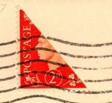
There is certainly a lot of variety in the desires of collectors. The philatelic desires, of course! While I am fairly flexible in my desires for certain types of cancellations, I do have my standards!
For example, I wouldn't buy the stamp that Erniejax displayed at the beginning of this discussion, even if I could afford it.To me, the cancellation looks like someone spilled ink on the stamp. I prefer stamps, including classic stamps, to have cancellations that don't look accidental, aren't sloppy, and don't hide the stamp's primary design element. Here's a good example from my collection of what I think of as a "perfect" cancellation:
And another, on an earlier stamp:
I'm less picky when it comes to hard-to-find stamps. This 1942 Mexico stamp, cropped from the cover it's on, isn't too difficult to find in mint condition, but trying to find a decently cancelled copy in good condition is nearly impossible, so I'm willing accept a cancellation that is less than museum-worthy:
Another stamp from my collection is this 1950s Hungary airmail stamp picturing a Russian MiG-15 jet fighter. It's one of my favourite stamps (a complete mint set was one of my very first approval purchases back in the early or possibly mid-1950s). I paid well over catalogue value for this stamp, despite the unreadable cancellations (note the purple cancellation — fiscal use?) and the clipped perfs at the lower left. Why did I pay more than CV? Because you just can't find used copies of this stamp! It's the only one I'ver seen, while mint copies are common as dirt:
I choose some used stamps because the cancellations, instead of "defacing" the stamp actually complement its design. That's the case with this Cuba stamp, picturing my favourite classic airliner, a Lockheed Constellation. Although the CDS cancellation is unreadable, I like how its circle complements the many arcs of the Connie's nose, rudders, wingtip, propellers and generally sinuous fuselage.
Bob
4 Members
like this post.
Login to Like.

Approvals
re: US Scott 191
Great info BOB!
I do love a good cancel, but I think that both strong and weak cancels are nice.
I'm split in-between!
Login to Like
this post

re: US Scott 191
Weak cancels. I scan them and make adjustment as required, print 1:1 and put on right side of stamp in stock book!
Works for me
Login to Like
this post